Articles and Research
Accessible Color Without Killing Your Design
Follow us:
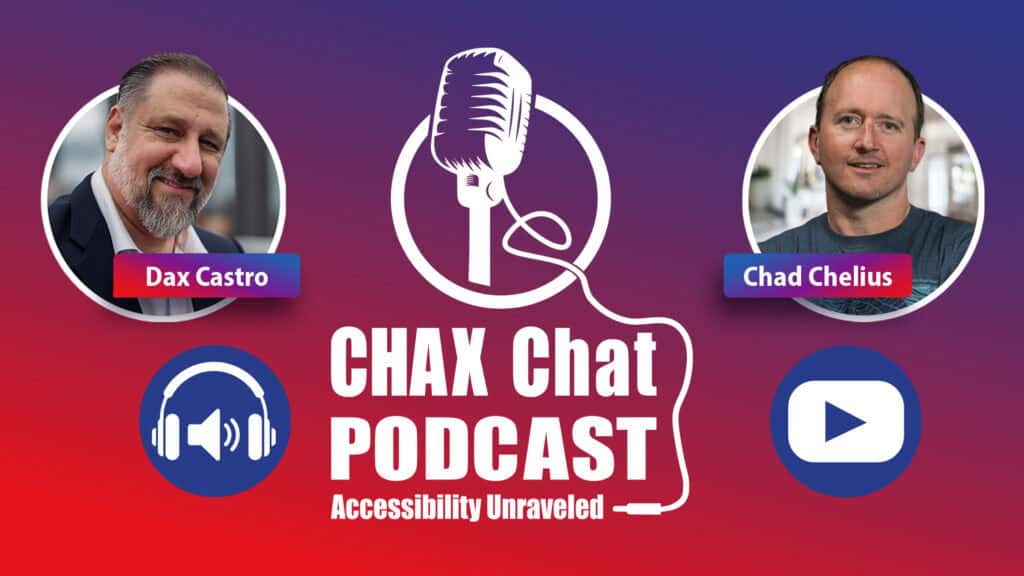
Does accessibility really mean ugly charts, boring colors, and pattern fills everywhere? In this episode, Chad Chelius and Dax Castro tackle accessible color head-on: what color contrast actually means, when it applies (and when it doesn’t), and how to handle charts, graphs, heat maps, and logos without trashing your brand. They break down the key WCAG contrast ratios, talk about the logo exemption, and share practical strategies like smarter legends, labels, and selective use of patterns instead of “pattern fill everything.”
Learn how building an accessible brand palette up front can save hours of rework, and how thoughtful body text and alt text work together for complex graphics. If you’ve ever been told “accessibility makes our visuals look terrible,” this episode will help you push back with solid reasoning and better design.
Listen to more Chax Chat Podcast Episodes

Need to speak with an expert right away?
Go to our Chax Expert Help Desk right away.
-
 90 mins
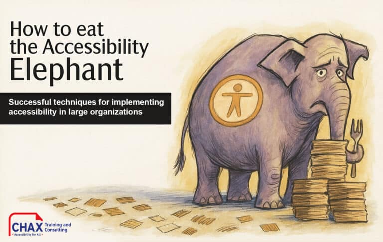
How to Eat the Accessibility Elephant: Successful Techniques for Implementing Accessibility in Large Organizations
Learn how to build an accessibility program that strengthens your brand, reduces risk, and creates lasting, organization-wide inclusion, one practical step at a time.1:00 pm EST | 10:00 am PST
In this article:
Related Content
Are You Fixing the Wrong Thing?

When Can You Archive a Document? DOJ Title II Explained
Related classes
-

 CAECs Eligible 3 Hours
 3 Free Plugins
Adobe InDesign Best Practices for Accessibility
Learn time-saving secrets that bring InDesign’s accessibility features to the forefront. As a bonus, receive Chax’s custom InDesign plugins and checklists! Designed for all levels of InDesign users.11:00 am EST | 8:00 am PST
-
 2 Hours
  CAECs Eligible
Accessible Social Media: The Inclusive Growth Advantage
Learn how to make your digital content more inclusive and effective. From alt text to captions, this course takes the guesswork out of accessible social media so your message connects…11:00 am EST | 8:00 am PST
-
 CAECs Eligible 2 Hours
Access Granted: Presentations and Events for Everyone
Are you thinking critically about your audience when creating presentations or planning events? With a little focus, intention, and inclusive tools, learn how to confidently present and host for all audiences.11:00 am EST | 8:00 am PST
-
 CAECs Eligible 3 Hours Free InDesign Plugin
Designing with Accessibility in Mind
Together, we identify the most common content-related accessibility barriers and overcome them with design decisions that free your creativity.11:00 am EST | 8:00 am PST
-
 CAECs Eligible 2 Hours
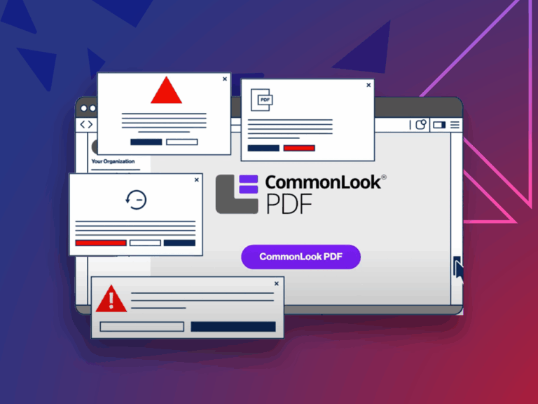
How to Effectively Use: CommonLook
Tired of the limitations of Adobe Acrobat when remediating PDFs at scale? Whether you’re new to CommonLook or looking to sharpen your skills, this session will help you remediate smarter,…11:00 am EST | 8:00 am PST
-
 CAECs Eligible 2 Hours
Make It Make Sense: Accessible Web Content
Make digital web content more accessible! Learn how to avoid barriers that negatively impact your audience. Dive deep into well-reasoned and researched judgment calls on WCAG standards.11:00 am EST | 8:00 am PST
Need help making your digital content more accessible?
Unravel common accessibility compliance principles! Download this useful WCAG in Plain English reference card.