Articles and Research

A 5 Step Guide to Accessible Data Visualizations
As analysts, the reason we spend time creating data visualizations is to communicate information. But what if the information you’re trying to communicate isn’t accessible? By paying attention to a few specific details, you can easily increase the accessibility of your data visualizations and communicate your insights to more people.
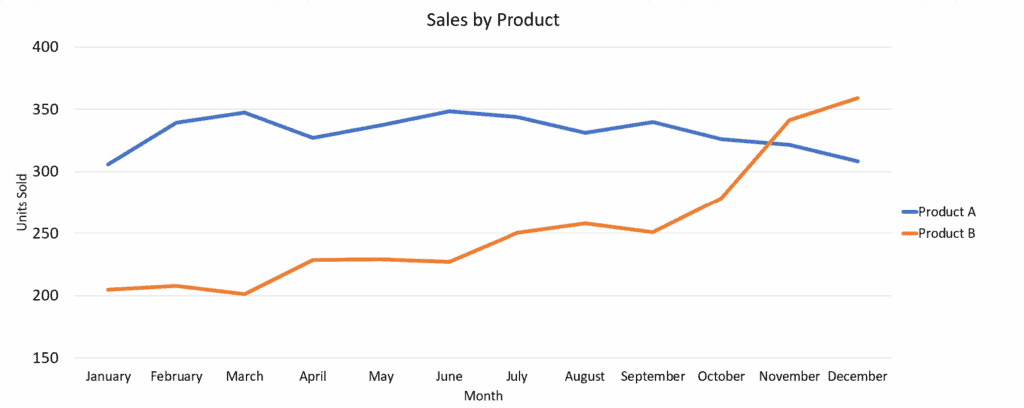
Starting with the default chart below that was generated in Excel, we will make 5 small adjustments, and we will end up with a much more accessible visualization.
Chart 1 – Starting Chart
1. Describe the main takeaway in text
Left-aligned, descriptive, text-based titles and subtitles communicate the most important information found in the visual.
Chart 2 – First Change
Product B’s performance has overtaken Product A
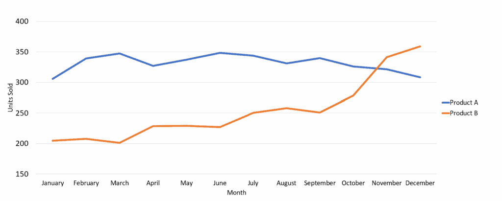
Product B’s sales increased steadily and since November have been higher than Product A, our consistent high-seller.
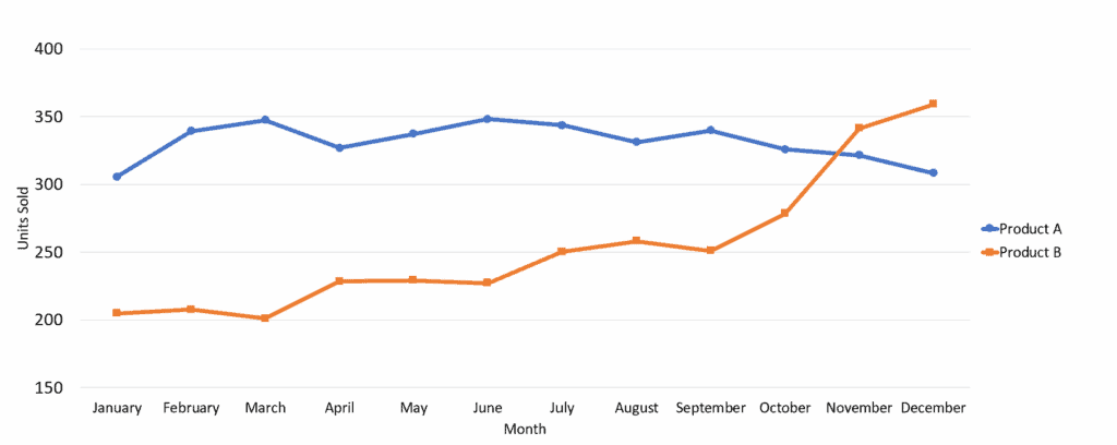
2. Don’t rely solely on color to differentiate data
Use features like fill patterns and icon shapes to differentiate data, instead of only using color. This will make your visualizations understandable to folks with colorblindness – and when it is printed in black and white!
Chart 3 – Second Change
Product B’s performance has overtaken Product A
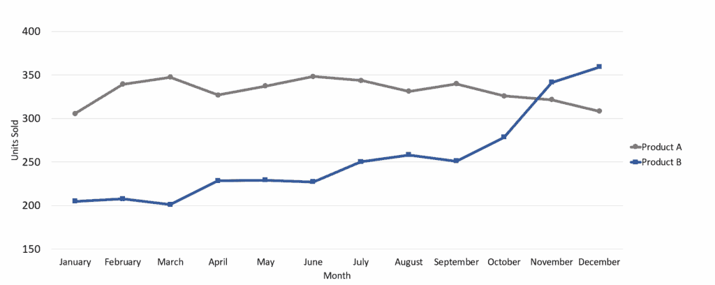
3. Pick your colors intentionally
Choose colors with good contrast to the background, and when in doubt, use fewer colors rather than more. Colors can be used selectively to highlight the information that is important.
Chart 4 – Third Change
Product B’s performance has overtaken Product A
4. Use whitespace to separate elements
Adding whitespace helps folks with low vision separate different data series and can help clarify intersecting lines on a line graph.
Chart 5 – Fourth Change
Product B’s performance has overtaken Product A
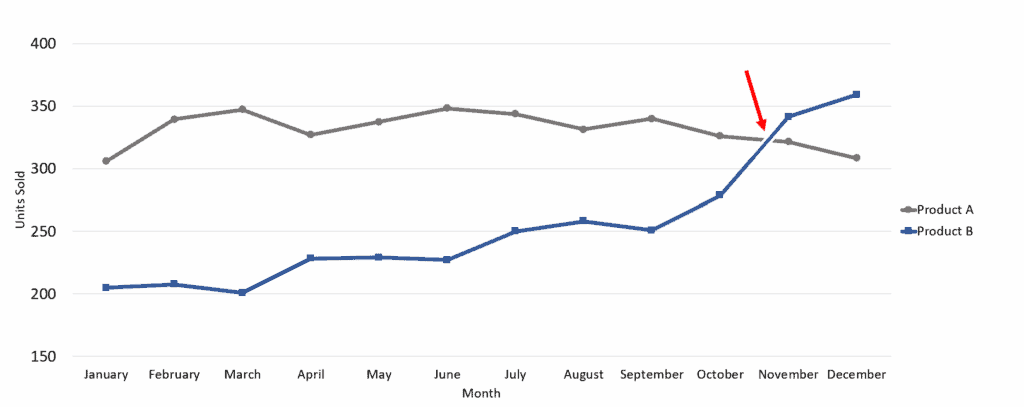
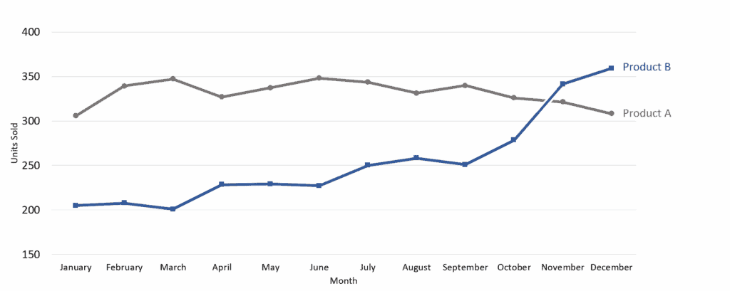
5. Label data series directly
By labeling data series directly, rather than using a key set off to the side, the viewer’s eyes do not have to bounce between two regions on the chart in order to understand which data belongs to which series.
Chart 6 – Ending Chart
Product B’s performance has overtaken Product A
Imagine your data visualizations reaching everyone, not just a select few. By following a few simple design principles, you can make that a reality. Not only will you be doing your job better, but you’ll also be contributing to a more equitable and informed society. It’s time to make your data visualizations more accessible.
___
Emma Barker is Tamman’s VP of Accessibility Services and a data analyst who loves diving deep into numbers and uncovering hidden stories. She is passionate about making data accessible to everyone, transforming complex datasets into clear and engaging visualizations.

Need to speak with an expert right away?
Go to our Chax Expert Help Desk right away.
In this article:
Related Content

Microsoft – Accessibility for Word and PPT

What Makes a Table Accessible?
Related classes
-
 CAECs Eligible
 3 Hours
 4 Free Plugins
Creating More Accessible Data Visualizations
Let’s explore some complex charts and graphs, define the ideal user experience, and use a proven formula to design and describe more accessible images.6:00 am EST | 3:00 am PST
-
 CAECs Eligible 3 Hours Special Offer
How to Effectively Use: MadeToTag
Tagged PDFs are essential for accessibility. Yet the post-export process can be very trying. Learn how to use the InDesign plugin MadeToTag to minimize some of the most tedious steps.6:00 am EST | 3:00 am PST
-
 CAECs Eligible 2 Hours
 Accessible Email Content and Design
Creating, designing, and developing emails presents interesting accessibility challenges. Learn how to avoid barriers that negatively impact those who receive your marketing content.6:00 am EST | 3:00 am PST
-
 CAECs Eligible 3 Hours
Accessible Best Practices for Tables
Tables are a great way to organize and present data. We cover the basics of how to build compliant tables, manage table structures, and resolve irregular accessibility checker errors.6:00 am EST | 3:00 am PST
-
 CAECs Eligible 2 Hours
How to Effectively Use: CommonLook
Tired of the limitations of Adobe Acrobat when remediating PDFs at scale? Whether you’re new to CommonLook or looking to sharpen your skills, this session will help you remediate smarter,…6:00 am EST | 3:00 am PST
-
 CAECs Eligible 3 Hours
Document Testing with NVDA, a Screen Reader
Assistive technology may feel daunting. Testing a document with a screen reader, like NVDA, is the ultimate way to ensure accessibility. We empower you with an evaluation checklist and various…6:00 am EST | 3:00 am PST
Need help making your digital content more accessible?
Unravel common accessibility compliance principles! Download this useful WCAG in Plain English reference card.